Last updated on June 25th, 2025 at

Kartik Sharma ✅
Reviewed by Email Marketing Expert
Kartik Pandit, Founder of WPKartik
6+ years of experience helping businesses boost revenue through high-converting email campaigns.
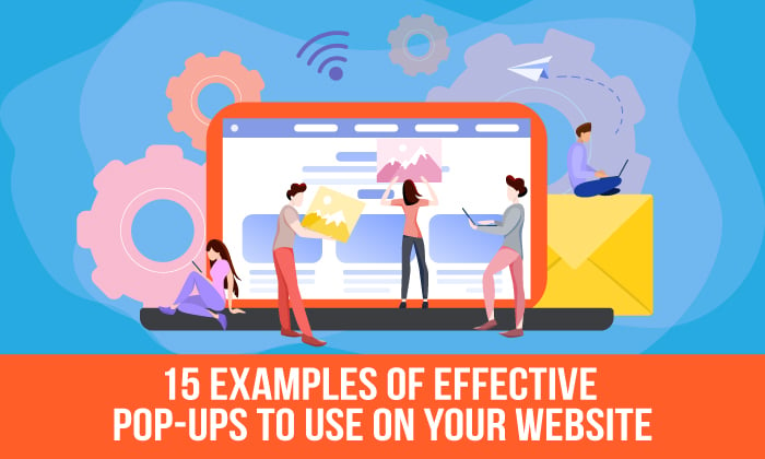
Why Pop-Ups Are Essential for Your Website’s Success
Whether you love them or loathe them, one thing’s for sure: pop-ups are a powerful tool to get your offers in front of website visitors. The more people who see your message, the higher your chances of converting them into leads or customers.
In this article, we’ll dive into pop-up best practices to help you use this tool to its full potential. Plus, we’ll showcase 21 creative and effective pop-up examples that you can draw inspiration from.
By the end of this post, you’ll have fresh ideas to create eye-catching pop-ups, grow your email list, and ultimately boost your website’s performance. Ready to take your conversions to the next level? Let’s jump in!
What Are Pop-Ups and Why They Still Matter in 2025
Pop-ups are small windows or boxes that appear on a website when you visit it. They can offer a discount, ask you to sign up for a newsletter, or share special deals. They don’t need you to click on anything to appear—they just show up!

How do they work? Pop-ups typically appear when certain actions happen—like when you’ve been on a site for a while, or when you’re about to leave. This helps grab your attention just at the right moment.
Why They Still Matter:
Even in 2025, pop-ups remain a top tool for website owners because they work. With so many distractions on the web, it’s tough to grab someone’s attention. Pop-ups allow you to stand out and show your visitors something that might interest them—whether it’s a discount, special offer, or something else of value.
Despite the bad rap they sometimes get, pop-ups continue to be one of the most effective ways to increase engagement and conversions. They’re simple, effective, and, when done right, don’t feel intrusive at all. They’ve been around for a while, but they’re still going strong and are even more creative than ever before!
“The secret to pop-ups is not how frequently they appear, but how well they connect with your audience’s needs.” – Kartik Sharma
Types of Pop-Ups: Examples That Work Best for Your Website
Traditional Pop-Ups (The Ones You Love to Hate):
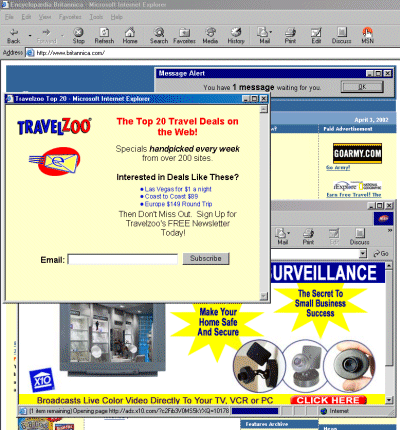
Traditional pop-ups are the ones that show up uninvited, often interrupting your browsing experience. They’re usually ineffective because they appear too early, frustrating users and causing them to leave.
Exit-Intent Pop-Ups: Catching Users Before They Leave
Exit-intent pop-ups are triggered when a visitor shows signs of leaving your site—like moving their mouse toward the browser’s close button. Instead of annoying users, these pop-ups provide a last-minute chance to engage them with a relevant offer or reminder right before they exit.
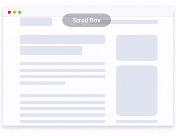
Scroll-Triggered Pop-Ups: Engaging Users at the Right Moment
Scroll-triggered pop-ups appear when a user has scrolled a certain percentage down a page, indicating they’ve engaged with the content. These pop-ups typically appear when visitors show interest, making them more likely to act on the offer.
Time-Delayed Pop-Ups: Giving Users Time to Engage
Time-delayed pop-ups appear after a user has spent a certain amount of time on a page, indicating they’ve had enough time to engage with the content. These pop-ups help avoid interrupting visitors too early and provide a thoughtful, timely nudge.

In-Line Pop-Ups: Seamlessly Blending Into Your Content
In-line pop-ups appear directly within the content itself, often as banners or inline forms. They don’t interrupt the user experience but provide an opportunity to engage visitors while they’re already focused on the content.
Pop-Up Examples That Actually Work (Real-Life Case Studies)
1. Exit-Intent Pop-Up (Cart Abandonment)
Example: Shopify
Why It’s Good:
Shopify itself uses exit-intent pop-ups to help eCommerce businesses recover abandoned carts. When a shopper is about to leave without completing their purchase, Shopify triggers a pop-up that offers an instant discount or free shipping to motivate the customer to finish their transaction. For example, if a customer has items in their cart but begins moving their mouse towards the browser tab, Shopify displays a pop-up offering 10% off or free shipping if they complete the purchase within a limited time.
2. Welcome Pop-Up (On First Visit)
Example: Beardbrand

Why It’s Good:
Beardbrand uses a welcome pop-up to greet new visitors as soon as they land on their site. When a user visits for the first time, the pop-up appears offering a 10% discount on their first purchase in exchange for signing up for the newsletter. This welcome gesture not only encourages new users to engage with the brand but also starts building a relationship right from the first interaction. It’s a great way to make a memorable first impression, build trust, and offer immediate value.
3. Scroll-Triggered Pop-Up (Content Engagement)
Example: Help Scout’s Blog
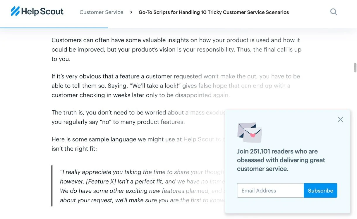
Why It’s Good:
Help Scout uses scroll-triggered pop-ups to engage visitors who have already shown interest in his content. When users scroll a certain percentage of the page, a pop-up appears offering a content upgrade, such as a free eBook or PDF that complements the blog post. By waiting until the visitor has engaged with the content, the pop-up feels more relevant and valuable, rather than intrusive. It’s a great way to capture leads from users who are already interested in the material, increasing the chances they’ll take action.
4. Time-Delayed Pop-Up (Engagement Based on User Time)
Why It’s Good:
MailerLite uses time-delayed pop-ups to offer users the chance to sign up for their newsletter after they’ve spent a certain amount of time browsing. For example, after 30 seconds of reading an article, a pop-up appears asking users to subscribe to their newsletter. This approach ensures that the visitor has engaged with the content before being asked for their information, making the request feel less intrusive. By waiting until the user has spent time on the site, BuzzFeed increases the likelihood that the visitor values the content and is more open to receiving additional updates.
5. Welcome Mat Pop-Up (Full-Screen Intro)
Example: 99designs
Why It’s Good:
99designs uses a welcome mat pop-up as a full-screen overlay when users first visit their site. This pop-up takes over the entire screen and offers a special promotion or call to action, such as inviting visitors to “Get started” on a design project or offering a discount on their first purchase. By grabbing the visitor’s attention right away with a clean, compelling offer, 99designs ensures that the user is immediately aware of what they can do next, leading to higher engagement and conversions.
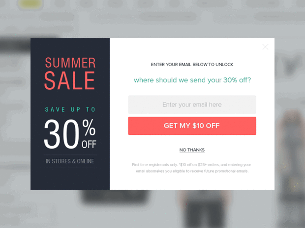
6. Discount Offer Website Pop-Up
Example: PipSnacks
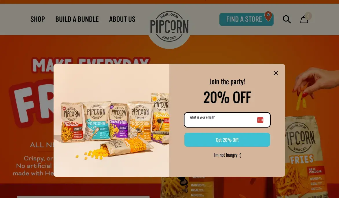
Why It’s Good:
PipSnacks, a popular snack brand, uses discount offer pop-ups to engage new and returning visitors. When a user lands on their site, a pop-up appears offering a discount on their first order or a limited-time promotion to entice them to make a purchase. For example, they might offer a 15% discount for first-time visitors who sign up for their newsletter. This strategy works well because it provides immediate value to the visitor and incentivizes them to make a purchase or take action right away, increasing conversions.
7. Alo Yoga
Why It’s Good:
Alo Yoga uses discount offer pop-ups to encourage first-time visitors to make a purchase. When you visit their website, a pop-up offers an immediate 10% discount in exchange for signing up for their newsletter. This simple but effective strategy entices potential customers with an attractive offer and gives them a reason to engage with the brand right away. It’s a great way to turn casual browsers into paying customers by offering them something valuable in exchange for their information.
8. Spin-the-Wheel Pop-Ups
Example: Crocs
Why It’s Good:
Crocs uses spin-the-wheel pop-ups to engage visitors and offer them fun and interactive ways to win discounts, free products, or exclusive offers. When users land on the website, they are prompted to spin a virtual wheel in exchange for signing up for the newsletter or making a purchase. The wheel might offer a range of prizes, from 10% off to free shipping, creating an element of surprise and excitement. This gamified approach grabs attention and encourages visitors to engage more deeply with the brand.
Hello Bar Pop-Up
Example: Elegant Themes
Why It’s Good:
Elegant Themes uses a Hello Bar pop-up at the top of their website to promote special offers, events, or calls to action without disrupting the user experience. The Hello Bar is a non-intrusive, slim banner that sits at the top of the page, ensuring that visitors can easily see the message without it taking up too much screen space. It’s perfect for highlighting a key promotion, like a limited-time discount, a new product launch, or even driving traffic to a specific page, such as a landing page or blog post.

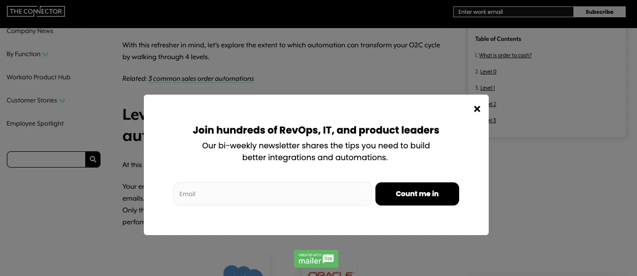
10. Benefits-Focused Pop-Up
Example: Workato
Why It’s Good:
Workato uses a benefits-focused pop-up to highlight the advantages of their product to visitors. Instead of simply promoting a discount or offer, this pop-up focuses on what users will gain by signing up or using their platform. For example, the pop-up might emphasize benefits like improved efficiency, automation capabilities, or how users can integrate their systems seamlessly with Workato’s platform. This approach appeals to visitors’ desire for value and solutions, rather than just providing an incentive or promotion.
11. Lead Magnet Pop-Up
Example: Photoshop Mosaic
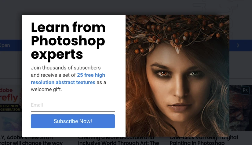
Why It’s Good:
Photoshop Mosaic uses a lead magnet pop-up to attract visitors by offering valuable content in exchange for their contact information. When users land on their site, a pop-up appears offering a free downloadable guide, template, or tutorial in exchange for subscribing to their newsletter. This tactic provides immediate value to visitors, which increases the likelihood of them providing their email address or taking the desired action. By offering something relevant and useful, this pop-up builds trust with visitors and motivates them to become part of your audience.
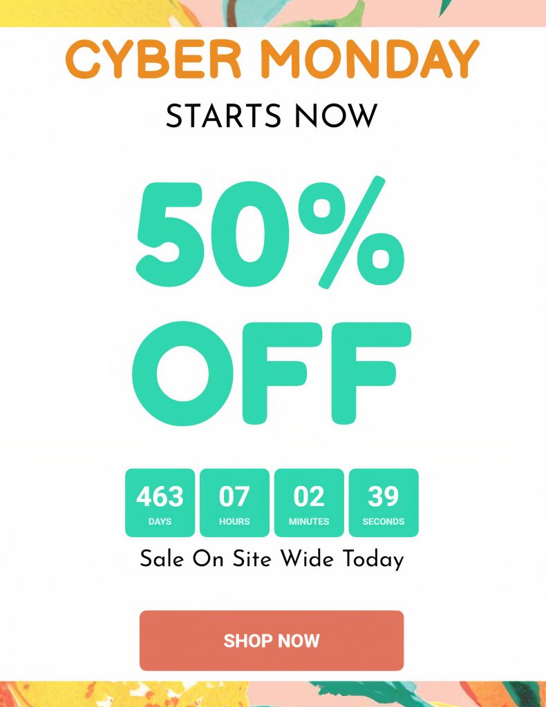
12. Sale Promotion Pop-Up
Example: MailerLite
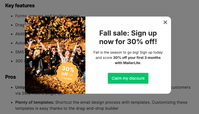
Why It’s Good:
MailerLite uses sale promotion pop-ups to create urgency and encourage visitors to take immediate action. When users land on the site, a pop-up appears offering a limited-time sale, like a 20% discount on their services, prompting them to sign up or purchase before the offer expires. The pop-up usually includes a countdown timer, which adds a sense of urgency and encourages visitors to make a decision quickly. This strategy leverages FOMO (Fear of Missing Out), a powerful psychological trigger that drives conversions.
13. Cheat Sheet Pop-Up
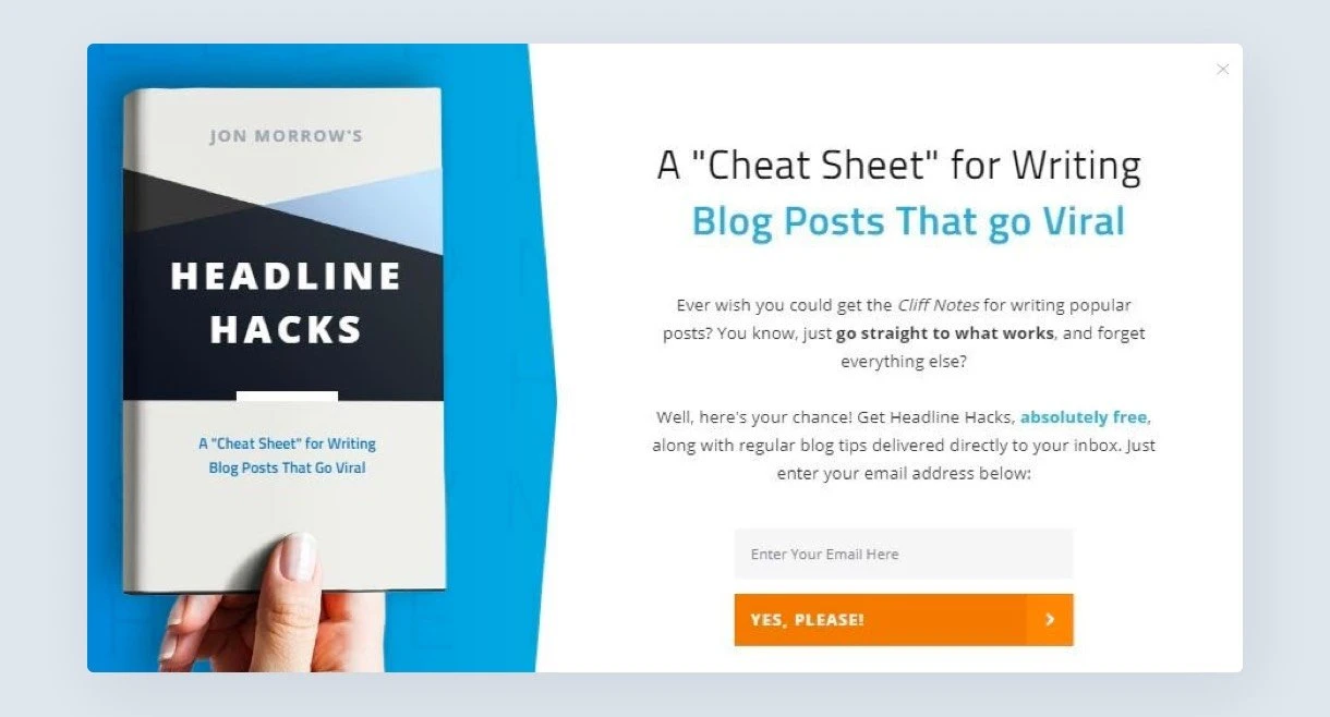
Example: SmartBlogger
Why It’s Good:
SmartBlogger uses a cheat sheet pop-up to provide visitors with quick, easy-to-digest resources that can help them improve their skills or knowledge in a specific area. For example, they might offer a “Blogging Cheat Sheet” that breaks down essential blogging tips or a “Writing Guide” for faster content creation. This pop-up offers real value by presenting the information in a simple, actionable format, making it ideal for visitors who want immediate help without sifting through long content.
By offering a cheat sheet in exchange for an email address, SmartBlogger builds a stronger connection with its audience and provides something that users will keep handy and refer to—making it more likely they’ll convert to long-term subscribers or customers.
14. Added Value Pop-Up
Example: MailerLite
Why It’s Good:
MailerLite uses an added value pop-up to provide visitors with extra value for signing up or taking action. Instead of just asking visitors to join their email list or make a purchase, MailerLite offers something additional, such as exclusive access to premium content, bonus tools, or free templates. This pop-up emphasizes that users will get more than expected, making it a win-win situation. The key is to offer something that directly complements your core product or service, such as extra resources that enhance the user experience.
By offering added value, MailerLite increases the likelihood that visitors will engage with the pop-up. It makes the offer feel more like a special opportunity rather than a mere request, which can significantly boost conversion rates.
Quiz Pop-Up
Example: Tony Robbins
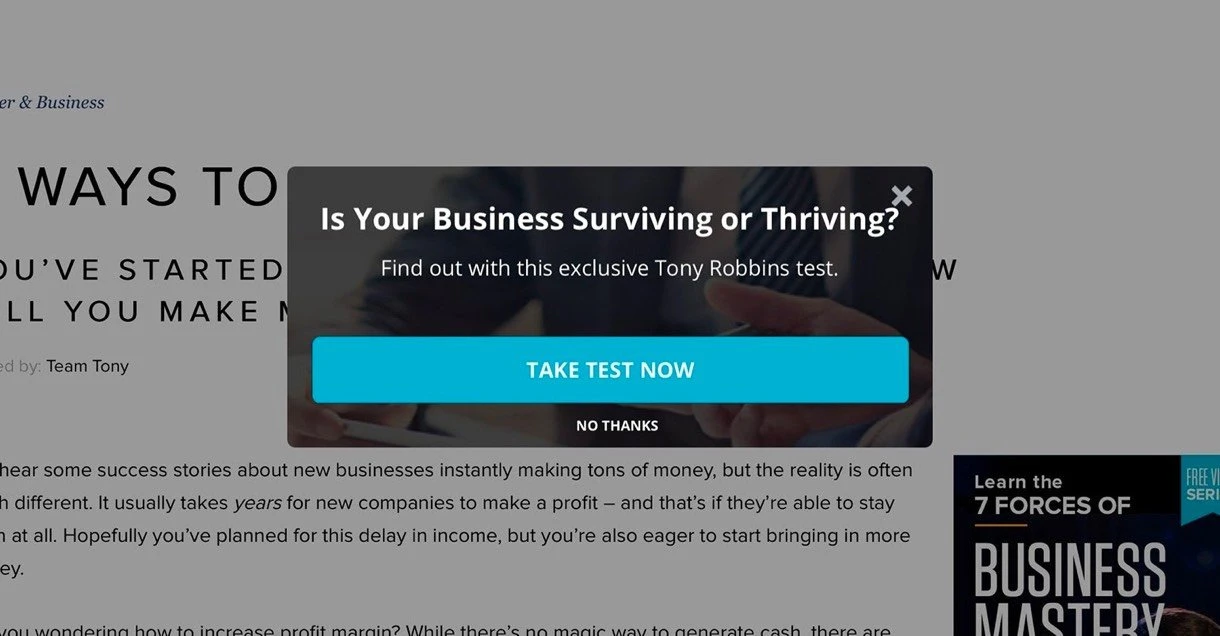
Why It’s Good:
Tony Robbins uses a quiz pop-up to engage visitors by offering a personalized experience. The pop-up invites visitors to take a short quiz (e.g., “What’s your financial freedom score?” or “Which Tony Robbins program is right for you?”), providing value in the form of tailored recommendations or insights based on the quiz results. This type of pop-up appeals to visitors’ desire for personalization and self-improvement, offering them something actionable in exchange for their attention. It engages visitors in a fun, interactive way, making them more likely to stick around and take the next step.
By offering an engaging, personalized experience, the quiz pop-up turns a standard sign-up into a more interactive and appealing process. It also helps build rapport with visitors by offering them something unique and tailored to their needs or interests.
16. Early Access Pop-Up
Example: Satisfy Running
Why It’s Good:
Satisfy Running uses an early access pop-up to create exclusivity and generate buzz around their product launches. When visitors land on their website, they are greeted with a pop-up offering early access to new product drops, such as limited edition gear or pre-order access to upcoming collections. This pop-up invites users to sign up or provide their email addresses to be the first to know about these exclusive offers, making them feel like VIPs.
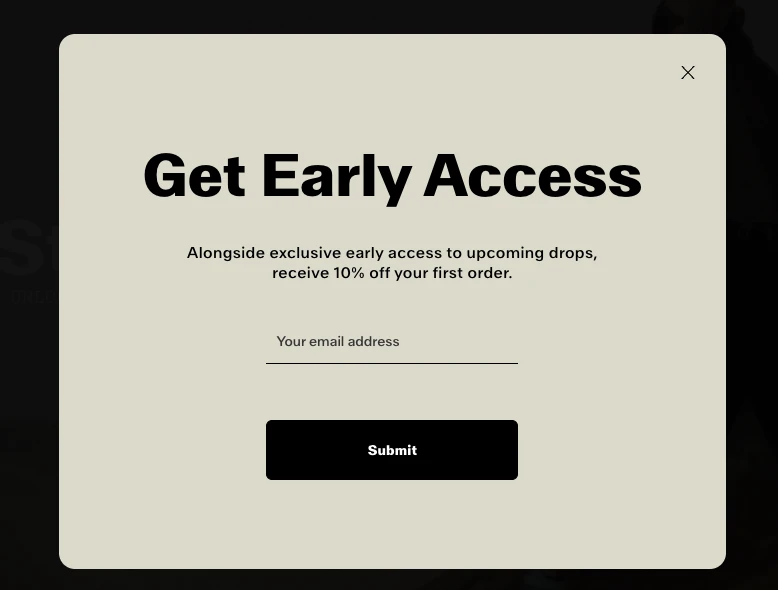
The early access pop-up taps into the psychology of exclusivity and anticipation, motivating users to act quickly before the opportunity disappears. By creating excitement around a product release, Satisfy Running builds anticipation and turns their visitors into highly engaged, motivated buyers.
17. Teaser Pop-Up
Example: MailerLite
Why It’s Good:
MailerLite uses a teaser pop-up to build anticipation and pique curiosity. Rather than offering a direct discount or a product right away, the teaser pop-up gives visitors a sneak peek of something exciting that’s coming soon—whether it’s a new feature, a special event, or a future product release. The goal is to tease the visitor with just enough information to spark their interest, making them want to sign up to stay in the loop.
This type of pop-up is great for generating excitement and keeping users engaged by offering them a glimpse of something exclusive or upcoming. By teasing your audience with an interesting offer or announcement, you increase the likelihood that they’ll return to your site or join your email list to get more details when the offer is officially launched.
18. E-Book Promotion Pop-Up
Example: Tim Ferriss
Why It’s Good:
Tim Ferriss uses an e-book promotion pop-up to offer his visitors free or discounted access to one of his e-books in exchange for their email addresses. The pop-up provides an enticing offer, such as exclusive content, a free chapter, or discounted access to one of his popular books (e.g., The 4-Hour Workweek). This type of pop-up adds significant value for users while building Ferriss’ email list at the same time.

E-book promotion pop-ups work particularly well because they combine educational content with incentives. Users are often motivated to sign up for something free, like an e-book, especially if it promises to solve a pain point or offer helpful insights. This pop-up is a win-win—it delivers something valuable to the visitor and allows Tim Ferriss to grow his email list for future promotions.
19. Coupon Pop-Up
Example: Perfect Glasses
Why It’s Good:
Perfect Glasses uses a coupon pop-up to offer visitors a discount code when they first land on the site or after they’ve been browsing for a certain amount of time. This type of pop-up typically offers a percentage off (e.g., 10% off your first order) or a specific dollar amount off the total purchase. By providing an immediate discount, the coupon pop-up encourages visitors to take action and complete their purchase, reducing cart abandonment and boosting conversions.
Coupon pop-ups are highly effective because they provide an immediate incentive for visitors to buy. Shoppers are often drawn to deals and discounts, and the excitement of getting a deal can drive people to complete their purchase sooner rather than later. This pop-up type also works well in e-commerce settings, where price sensitivity is common.
20. Survey Pop-Up
Example: Healthy Essentials
Why It’s Good:
Healthy Essentials uses a survey pop-up to gather feedback and insights from visitors about their health and wellness needs. This pop-up usually appears after a visitor has spent some time on the site, offering a short and engaging survey that asks questions related to their preferences or interests. In exchange for completing the survey, users are often given a reward, like a discount, free shipping, or access to exclusive content.
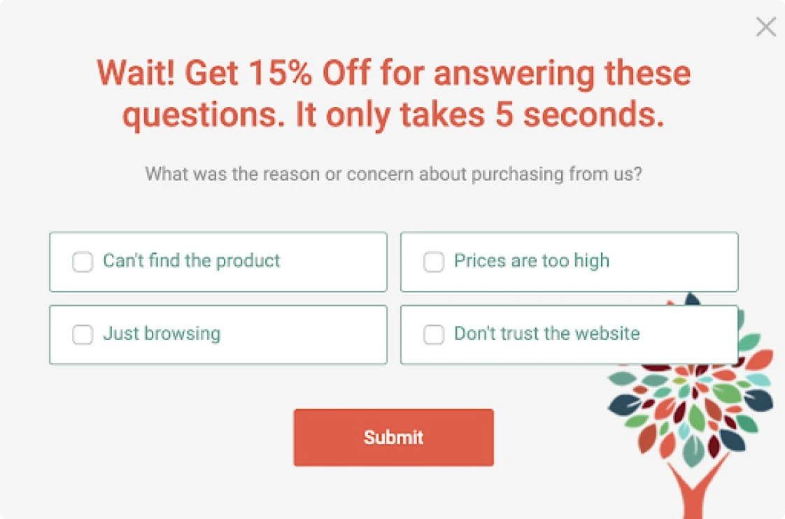
The survey pop-up is great because it not only engages visitors but also gathers valuable data that can help you improve your website and tailor your offerings. It helps you better understand what your customers want, which allows you to make data-driven decisions that improve customer satisfaction and drive conversions.
21. Appointment Schedule Pop-Up
Example: Rhinofit
Why It’s Good:
Rhinofit uses an appointment schedule pop-up to help visitors book consultations or services directly from their website. When users visit the site and show interest in a service, the pop-up prompts them to schedule an appointment with just a few clicks. The pop-up usually offers an easy-to-use calendar or booking form, making it simple for users to choose a convenient time for their appointment. This is especially effective for businesses that rely on appointments or consultations, like health clinics, fitness centers, or service-based companies.
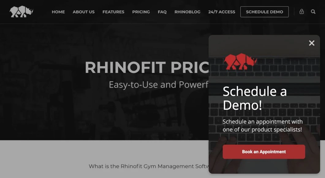
The appointment schedule pop-up eliminates the friction involved in setting up appointments and provides a seamless, convenient booking experience for visitors. It helps businesses increase conversion rates by making it easier for users to take the next step, without the need to leave the site or search for contact information.
How to Create a Great Email Pop-up – (Step-by-Step Guide)
Step 1: Set Your Goal
Before you do anything, ask yourself: What do I want to achieve with this pop-up?
Lead Generation: Grow your email list?
Sales Conversion: Promote discounts or special offers?
Content Engagement: Encourage users to download a guide or join a webinar?
Tip: Be super clear on your goal, so your pop-up message is tailored to that. Keep it simple and direct.
Step 2: Choose the Right Type of Pop-up
There are several types of pop-ups, and choosing the right one is key. Here are a few options:
Entry Pop-up: Appears when the page loads.
When to use: Right after a visitor lands on your site.
Example: Someone opens your online store’s homepage and sees an offer for 10% off if they sign up.
Exit-Intent Pop-up: Appears when the user is about to leave.
When to use: When the visitor is about to leave.
Example: A visitor is leaving your site with items in their cart, and a pop-up offers them 15% off to complete their purchase.
Scroll Pop-up: Appears after the user has scrolled a certain amount down the page.
When to use: After the visitor has scrolled down the page.
Example: Someone reads half of your blog post and then sees a pop-up offering a free download if they subscribe.
Time Delay Pop-up: Shows up after the user has been on the page for a set period of time.
When to use: After the visitor has spent a certain amount of time on your page.
Example: A visitor has been on your product page for 30 seconds and sees an offer for free shipping when they sign up.
Step 3: Craft Your Message
Your message is the heart of your pop-up. Here’s how to make it shine:
Be Clear & Concise: People are busy! Keep your message short and to the point.
Example: “Get 10% off your first order when you subscribe!”Focus on Benefits: Explain what the user gets, not just what you’re offering.
Example: “Get exclusive updates, discounts, and offers sent straight to your inbox!”Use Action Words: Encourage action. Words like “Join,” “Get,” “Unlock,” “Subscribe,” make it feel like a call to action.
Step 4: Design for Attention (But Don’t Annoy)
Your pop-up should catch the eye but not annoy the user.
Colors & Fonts: Make it stand out, but keep it brand-consistent. Use contrasting colors for the CTA button to draw attention, but don’t go overboard.
Clear CTA Button: The button should be bold and clear. Words like “Get Started,” “Claim My Offer,” or “Join Now” work great.
Images: If relevant, include a simple, eye-catching image or icon. Avoid cluttering the pop-up with too much text or too many visuals.
Step 5: Add a Strong Offer
If you’re trying to grow your email list, people need a reason to subscribe. The offer should be:
Valuable: Discounts, free resources, special deals, etc.
Limited: Use urgency with phrases like “Limited Time” or “Only X Left.” This helps prompt action.
Exclusive: Make users feel special for joining your list.
Step 6: Optimize for Mobile
About half of web traffic comes from mobile, so your pop-up must look and function perfectly on smaller screens.
Size Matters: Ensure buttons are easy to click on mobile devices.
Less is More: Keep the design simple for mobile. Avoid clutter and ensure it’s quick to load.
Step 7: Set Triggers & Timing
Choose when and how the pop-up will appear.
Time-based trigger: Show the pop-up after a user has been on the site for, say, 10 seconds.
Exit-intent trigger: Show the pop-up when the user is about to leave your site.
Scroll trigger: Show it after the user has scrolled 50% of the page to show they’re interested in your content.
Step 8: Use A/B Testing
Test different versions of your pop-up to see what works best.
Test headlines: Try different ways of wording your offer to see which gets more attention.
Test designs: Experiment with colors, images, or even different pop-up types.
Test CTA buttons: See if “Get 10% off” works better than “Join the Club” to see which gets more clicks.
Step 9: Add a Close Button & Exit Option
No one likes to be trapped! Make sure your pop-up has an easy way to exit.
X Button: Make sure the close button is clearly visible and easy to click.
Escape Option: If you’re using an overlay, make sure users can click outside to dismiss the pop-up.
Step 10: Integrate with Your Email Marketing Tool
To make things seamless, connect your pop-up form to your email marketing tool (like Mailchimp, ConvertKit, etc.). This way, all the emails you collect are automatically added to your email list.
Step 11: Monitor & Optimize
Once your pop-up is live, don’t just leave it. Track its performance:
Conversion Rate: How many people are subscribing versus how many see the pop-up?
Exit Rate: Are people closing the pop-up too quickly?
Engagement: Are visitors clicking the CTA button and taking the desired action?
Make tweaks as needed to improve performance. Even small changes can make a big difference!
Bonus Tip: Avoid Overusing Pop-ups
While pop-ups can be incredibly effective, don’t overwhelm your visitors. Don’t show them the pop-up too frequently on the same visit, and make sure it doesn’t interfere with their browsing experience. You want them to appreciate the offer, not get annoyed by it.